Custom Skin
Changing Defaults
The look of the grid can be fully (or nearly fully) customized in CSS. dhtmlxGrid contains a set of CSS classes that define different aspects of the grid. ( all above rules defined in dhtmlxgrid.css )
Most commonly-used styles are the following:
    div.gridbox // grid container
    div.gridbox table.hdr td // inner element of the header
    div.gridbox table.hdr td div.hdrcell // outer element of the header
    div.gridbox table.obj td // data cell
    div.gridbox table.obj tr.rowselected td.cellselected, div.gridbox table.obj td.cellselected // element in the selected cell
    div.gridbox table.obj tr.rowselected td // elements in the selected row
Footers:
    div.gridbox div.ftr // container of all footers
    div.gridbox div.ftr td // footer element
Column moving:
    div.gridbox table.hdr td.columnTargetR div.hdrcell // the marker used to mark drop-right in case of column moving
    div.gridbox table.hdr td.columnTargetL div.hdrcell // the marker used to mark drop-left in case of column moving
    .dhx_dragColDiv // representation of the dragged column
Edit related styles:
    div.gridbox table.obj td.editable{ // data cell in edit state
    .dhx_combo_select // select boxes inside grid editors
    .dhx_combo_edit // inputs inside grid editors
    .dhx_textarea // textareas inside grid editors
    .dhx_clist // checkbox list (clist excell)
Drag-and-Drop related styles:
    .dragSpanDiv // the element used as the drag text holder
    .gridDragLine // the marker of position during drag-and-drop (sibling and complex modes)
Rare used styles:
    .dhx_sub_row // a sub-row inside the grid
    div.gridbox .xhdr // the space to the right of the last header (if width of grid is greater than the sum of widths of the columns)
    div.gridbox table.row20px tr td // additional styles for data cell in case of fixed row height mode
    div.gridbox .objbox // data part of the grid
Skin Customization
Each skin is actually a subset of the default CSS class. For example, the following rules are defined in dhtmlxgrid.css for xp skin:
    div.gridbox_xp
    div.gridbox_xp .xhdr
    div.gridbox_xp table.hdr td
As it is seen, the only difference is in _xp postfix that is skin name. Thus, it will be _modern for modern skin, _light for light skin, etc. So, if the user needs to change the font for data cell in case of xp skin, he needs to edit div.gridbox_xp table.obj td rule instead of div.gridbox table.obj td.
The grid with the skin defined will use all the default CSS rules and all skin related rules.There is no need to write the same values again and again. Skin-related styles contain information that differs from the default one.
Alter CSS
Skin-related CSS classes have two additional rules that can be set:
    div.gridbox_xp .ev_xp // style will be applied to an even row
    div.gridbox_xp .odd_xp // style will be applied to an odd row
The right part of the style name here is also based on the name of the used skin, as it was described in the previous sample.
New Skin Creation
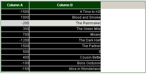
To create a new skin, the user should just create new CSS rules with necessary names. There is no need to do any code modifications to apply a new skin. For example, the following subset of rules are added:
    div.gridbox_inverse {
        border:1px solid #004000;
    }
    div.gridbox_inverse table.hdr td {
        background-color:#004000;
        color:white;
        font-weight:bold;
    }
    div.gridbox_inverse table.obj td{
        background-color:black;
        color:white;
    }
And later in JS code the following line will be used:
    <script>
        grid.setSkin("inverse");
    </script>
These custom styles will be applied to the grid and, as a result, the grid will be displayed like this:
